The Portfolio Optimizer for Wealth Management
The Portfolio Optimizer for Wealth Management
With Direct Indexing (DI), instead of buying an ETF that tracks a stock index, we buy the individual stocks. DI can increase after-tax returns through tax loss harvesting.
Our infrastructure allows us to investigate how tightly DI should track the index. If we track too tightly, we cannot harvest enough losses; if too loosely, tracking error will be high.
For more general background on DI, see here.
DI typically works by allowing a stock to be within a range of its target in the index. For example, if AAPL is 4% of the index, we may decide to allow AAPL to be ± 50% of its target, i.e. between 2% and 6%. [Note: this 4% is based on prices at a single point in time, because stock indexes are published in terms of shares, not dollar percentages, which change over time]. Our software supports a more general formula than a simple multiple of the target, but this works well in practice.
What is a good formula to use? If it results in ranges that are...
We used our backtest infrastructure to see how DI would have behaved in the past using ranges of ±0% (tracking the index perfectly), 10%, 30%, 50%, 70%, 90%, and 100%. We also generate web-based charts automatically for each individual backtest. These help investment research, but can be shared with end-clients as well, as they can be customized to their particular situation (tax rates, deposit patterns, etc.)
As we increase the allowable range for every stock index constituent, we expect that both pre-tax and after-tax returns will improve, and that tracking error will increase. It would be good to confirm this.
A useful feature we added is the ability to plot several backtests on the same chart. Instead of looking at 7 different charts, one for each range formula, it is much more informative to look at all 7 scenarios on the same chart. Click on this screenshot for an interactive version:
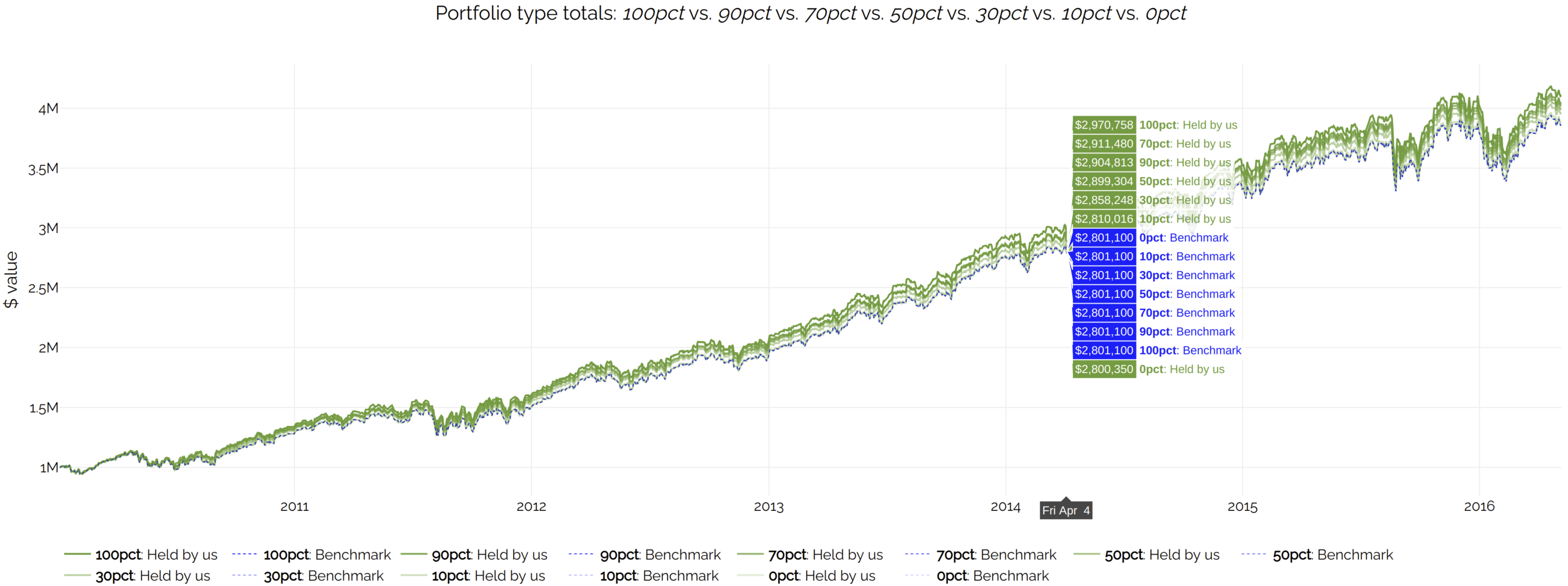
This shows the result we expected.
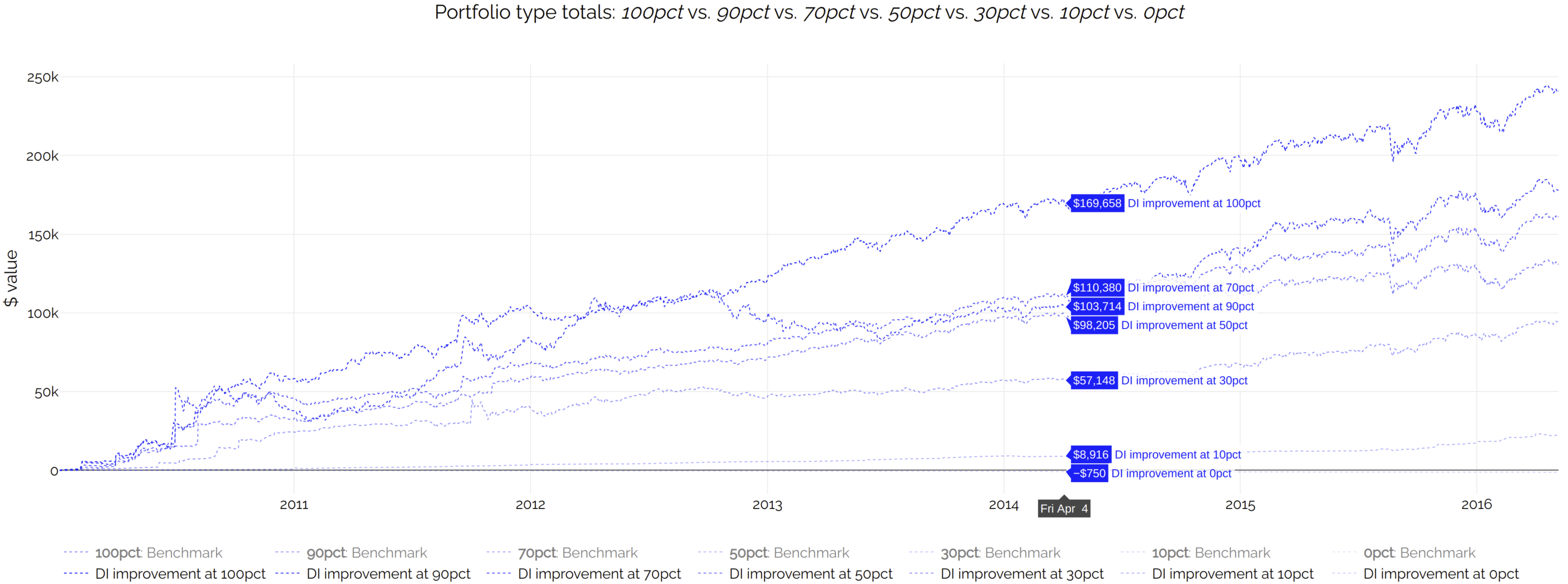
The differences are dominated by the scale of the chart. It is a bit easier to see the differences if you zoom in, by clicking and dragging a window over an area of the chart. However, a further improvement is a mechanism we built to plot a set of differences between arbitrary pairs of lines, just by passing certain parameters on the URL to specify how to construct those differences. The chart automatically scales to fit the visible lines only, so if we hide the other lines, the scale becomes smaller, and the differences become easier to see.
In this example, it is more informative to display the difference of the portfolio values minus the benchmark, for every backtested DI range (0%, 10%, 30%, etc.) Click on the screenshot for an interactive version:
These are a bit different. We cannot compare them to the benchmark, because the benchmark never pays taxes. Therefore, for a cleaner chart, we will compare all after-tax returns against the after-tax returns of the '0% DI' case. Click on the screenshot for an interactive version:
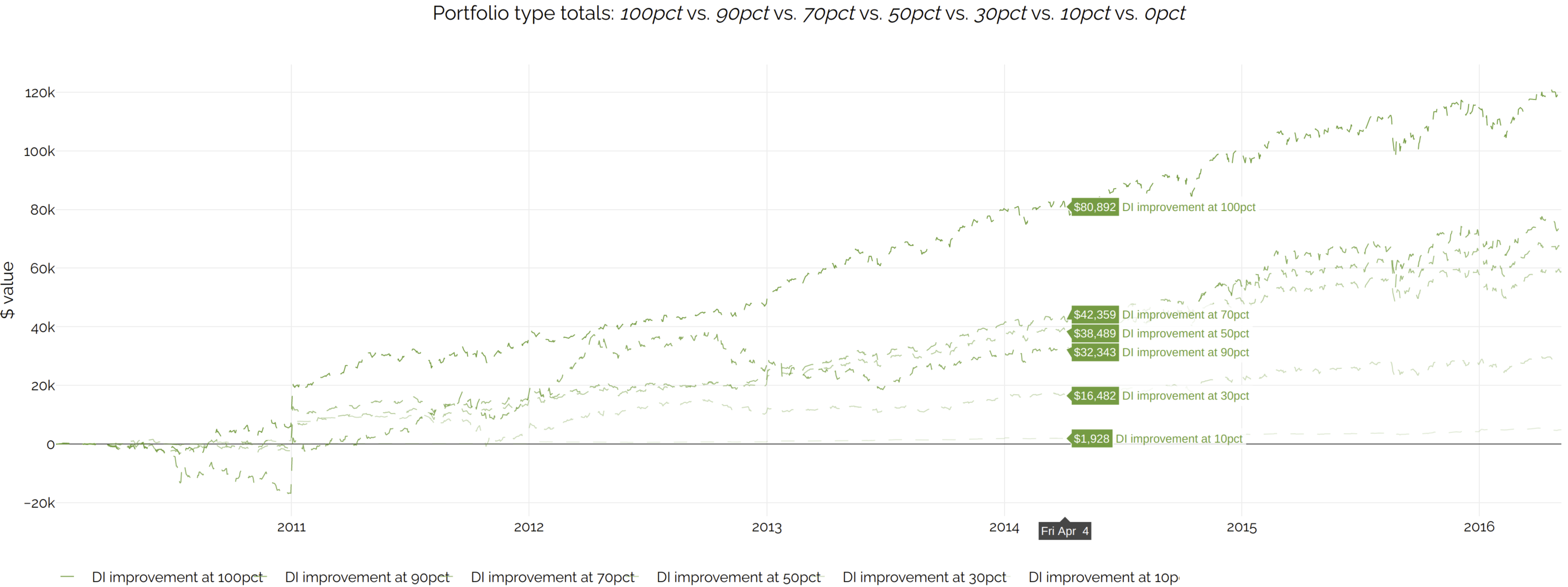
Note: the above liquidation values are calculated using long-term tax rates even for short-term tax lots. This results in a more stable metric, which is more useful for investment research. The idea is that, short of a full liquidation, there is rarely a reason why a client cannot wait for short-term gains to become long-term. However, you can still see the results using true tax here. The difference is more pronounced in the earlier part of the backtest, where a larger percentage of holdings are at a short-term loss or gain, due to the initial deposit being much larger than the subsequent ones.
We can search for daily tracking error (standard deviation of period return diff), weighted by portfolio value, in bps in the data grids for DI. The values are:
To convert to (more intuitive) annualized numbers, we can multiply by 16 (approximate square root of number of trading days in a year). Using the same links above, the improvement of 50% vs. 0% is 37 bps pre-tax (1195 - 1158) and 68 bps after-tax (1577 - 1509). 1.47 x 16 results in 23.5 bps of annualized tracking error, which is an acceptable price to pay for the increase in returns.
There is also a more visual (and arguably better) way to do this.
At the end of every backtest, we automatically generate many metrics; there are over 400 as of April 2020. We have built a general mechanism that can plot any arbitrary pair of those metrics against each other. In this case, we would like to look at the tradeoff of tracking error vs. returns, for every range setting (0%, 10%, etc.). Click on the screenshot for an interactive version:
![]()
We actually ran backtests for 21 ranges (0%, 5%, 10%, ... 100%). The discussion so far only mentioned 7 ranges (0%, 10%, 30%, 50%, 70%, 90%, 100%), in order to avoid clutter in the charts. However, because this plot only shows a single point per backtest instead of a line, it is easy to fit all 21 results. Backtests with tight tracking (red end of spectrum) have the lowest returns but also lowest tracking error. The inverse is true for backtests with looser tracking (green end of spectrum). The yellow ones are somewhere in between. This is all as expected.
The web page automatically draws a line of best fit, but in this case the relationship seems non-linear; the points seem to be on an upward-sloping curve. Points below the line and farthest from it are preferred; the correspond to high returns (x axis) with low tracking error (y axis). This confirms our initial conclusion that using 50% (the large yellow triangle) is a good choice.
Allowing every stock index constituent to vary between ±50% of its target gives an acceptable trade-off of after-tax returns vs. tracking error in the scenarios we analyzed. Our backtest infrastructure and automated chart generation makes it easy for investment researchers to ascertain this. Moreover, the charts can be useful in a client-facing context; unlike other commercial implementations, we can override the default range of ±50% to match individual client preferences. The charts can help advisors and their clients tune this preference.